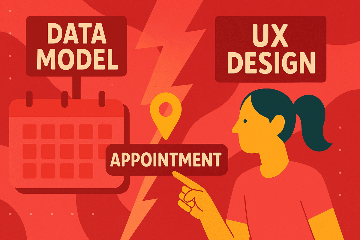
Data Models vs. UX Design: When User Needs Get Lost in Translation
- 8 Oct, 2024
I recently needed to schedule a bloodwork appointment that required fasting for 12 hours. Knowing that I can’t function without my morning coffee, I aimed for the earliest slot possible to minimize discomfort, but booking it was much harder than it needed to be.
This app’s main job was to help me find an early appointment easily. Did it succeed? Not even close. Instead, it forced me to do most of the work.
The Scheduling Struggle: Step by Step
Here’s what I experienced:
- Step 1: Select a location.
- Step 2: Choose a date.
- Step 3: Find an appointment time.
Sounds straightforward, right? But in reality, finding an early slot meant clicking through each day individually to check available times.
After failing to find an early appointment at my chosen location, I had to start over from Step 1 and search by location all over again.
This repetitive, clunky process left me thinking: if this organization can’t streamline something as simple as scheduling, how reliable will they be with my blood sample?
The Root Issue: Data Model vs. User Experience
This is a classic case of a user interface reflecting the app’s data structure, not the user’s needs. Here’s what the data model likely looks like:
- Locations Table: Lists each facility’s details, such as address, phone, and service hours.
- Operating Hours Table: Captures each location’s opening and closing times.
- Appointments Table: Records appointment times and their booking status.
From a data perspective, this setup makes sense. But it fails to account for user needs—especially those of time-sensitive users like me, who prioritize appointment time over location. Instead of easily finding the earliest appointment within a 5-10 mile radius, I was locked into a location-first process.
The Receptionist Effect: Prioritizing Time Over Location
When we’re in a clinic and need a follow-up, we usually ask the receptionist to find the soonest slot, trusting them to check across locations if needed. In an app, there’s no human to make that leap, so we need smart UX design to play that role.
Simple Fixes to Prioritize User Needs
To improve the experience, here are some easy design changes:
- Search by Time First: Add an “Earliest Appointment Nearby” option, searching across all locations within a given radius.
- Flexible Time Filters: Not everyone needs the earliest slot, so let users filter for “morning,” “afternoon,” or “anytime.”
- Streamlined Calendar View: Allow users to see availability across several days at a glance, rather than clicking day by day.
- Design for the User Journey: Prioritize the real user journey over the data structure, and think about how users actually interact with the scheduling process.
Why This Matters
Implementing these changes may require additional work from the product team, including UX and UI design improvements, but the payoff would be significant: higher satisfaction, higher booking rates, and greater patient trust. When scheduling is easy, users are more likely to return, recommend the service, and stay engaged with their healthcare provider.
Better user experience also reduces support inquiries. Patients who can book online easily won’t need to call, freeing up staff for more complex inquiries and increasing efficiency.
When customer experience often drives loyalty, these UX improvements send a clear message of commitment to patient care at every touchpoint—not just during appointments. Focusing on users’ needs rather than rigid data structures can transform appointment scheduling from a chore into a confidence-building interaction with the healthcare system.
Stay Ahead in Product Management!
Ready to elevate your product management game? Join our community of passionate professionals and be the first to receive exclusive insights, tips, and strategies directly in your inbox. Subscribe now to our newsletter and ensure you're always in the loop with the latest product management trends and wisdom bombs!